Today’s business-decisions have close connection with data analysis. Most analysis of business data is usually done by comparing multiple instances of single quantitative variable, such as sales across different regions. However, there is always a need to analyse data to find similarities and differences among group of objects. For example, finding best performing products across different regions by comparing their revenue, sales and marketing-budget. In other words, multiple instances of several variables at once. Data visualizations are great way to make sense of large sets of data by stimulating visual thinking. In this article, we will explore visualization techniques that can decode business data and make it comprehensible to analyse performance of products.
Let’s take an example. A telco company may have large variety of mobile-usage-plans to offer to its customers. To compare such plans the telco company may use following characteristics:
- Price
- Duration
- Revenue
- UnitsSold
- MarketingBudget
The value of all these variables for each mobile-usage-plan combine to form the plan’s multivariate profile. Now, we want to compare the profiles of such mobile-usage-plans.
Our analysis may revolve around following questions
Which mobile-usage-plans are alike?
Which mobile-usage-plans are most exceptional?
Initial goal of data-visualization is not to jump directly into numerical analysis but to gain insight. Once the user has good overall understanding of the dataset he can drill-down to get exact numbers and further analysis. To spot similarities or differences across the dataset a thoughtful use of visuals with uniformity is very crucial.
Following types of visual representation may be used for multidimensional data analysis
- Trellies or small multiples
- Multiple concurrent views with brushing and filtering
- Spider chart
- Heatmap
- Parallel Coordinates
In 1973, Herman Chernoff proposed to present multivariate data in the shapes of human faces. The idea behind Chernoff faces was that it is easy to recognize faces and notice minor change. However, for effective multidimensional analysis spider chart, also called ‘Whiskers’ or ‘Star’ is being used in many cases.
Spider Chart
We have already talked about trellies and multiple concurrent views with brushing in the previous post.Spider chart or Radar chart can be thought of as an advanced form of Chernoff faces. In the spider chart, multiple lines radiate out from a center point. Each line corresponds to different variable and length of each line encodes its value.
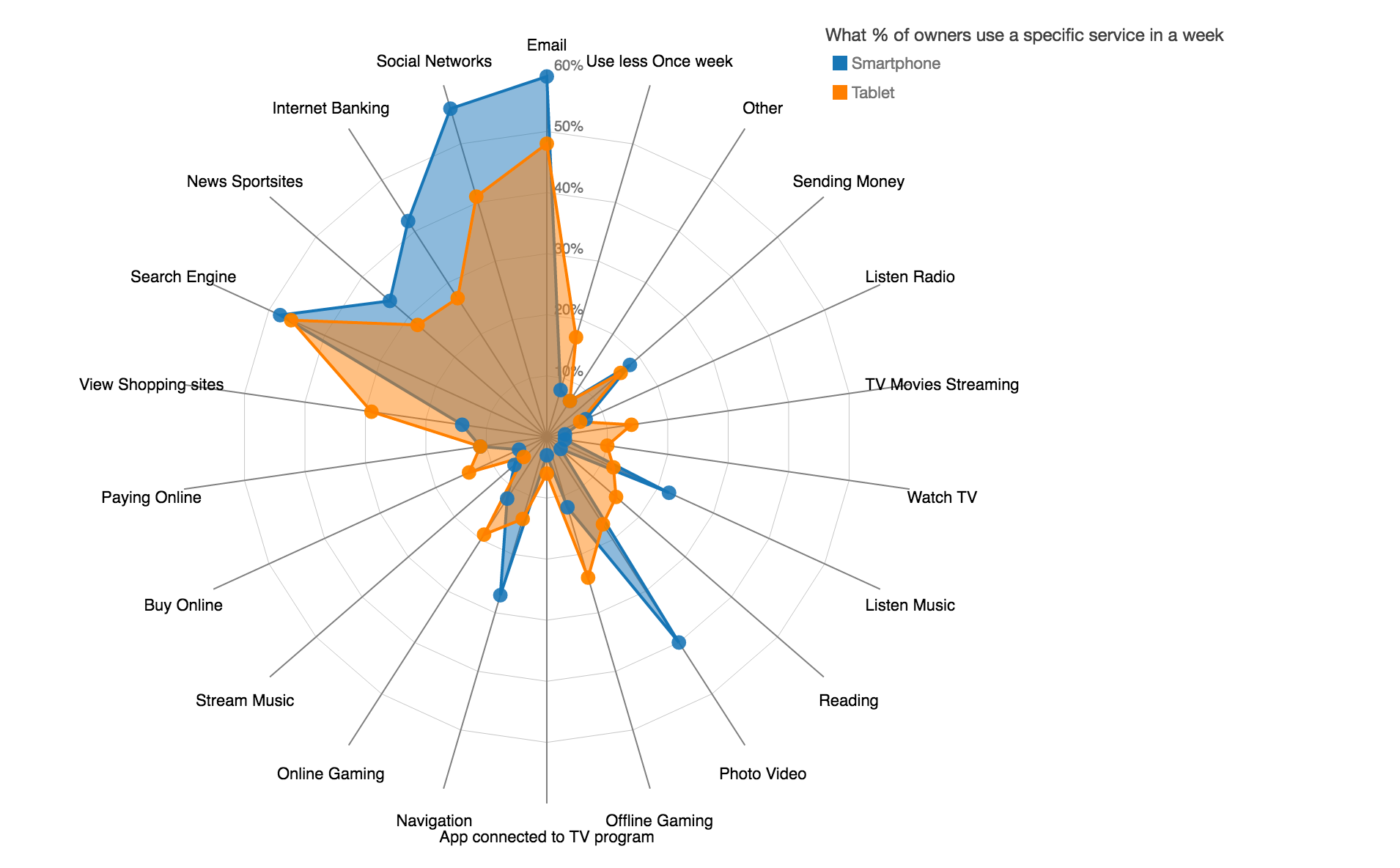
radar chart
Heatmap
Heatmaps are great to encode quantitative values as variations in colour or hue. Let’s take an example of a telco company’s heatmaps to display mobile-usage-plans. In the following heatmap, each row represents the plan’s profile. Higher then the average value is displayed in blue colour where as lower then the average value is displayed in red colour. Heatmaps are good at finding exceptions. In the example, we can see that plan-4 has all the values that are lower then normal values.We can see that plan-4 and plan-7 both seems to be new plans, as both are having short duration. However, plan-4’s poor performance my be because of low marketing budget as compared to plan-7.
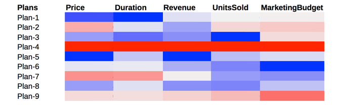
Heatmap
Better choice of colours like use of gray for the values near average can improve the visual attention for the extremes.
Parallel coordinates plots
Parallel coordinates can include hundreds of lines to represent each data-profile, such as a mobile-usage-plan, and provide great insight when used thoughtfully. Finding similarities between mobile-usage-plan performances and clustering them based on their similarity criteria. Make sure all the dimensions that you want to evaluate across each profile must be on the same percentage scale.
Advanced interactive visualization techniques like highlighting can be used to emphasise only those lines that user may be interested in focusing. For example, plans with lowest marketing budget and then analysing their revenue. Identifying similarities using such visual patterns,especially for analysing product performance, is way simpler then scrolling through tables of rows and columns.
Further techniques like brushing and filtering can be used to gain detailed insights. Statistical clustering algorithms are quite complicated. However, current advancements in visualization techniques and tools allow to turn business data into visually comprehensible objects to gain insights.
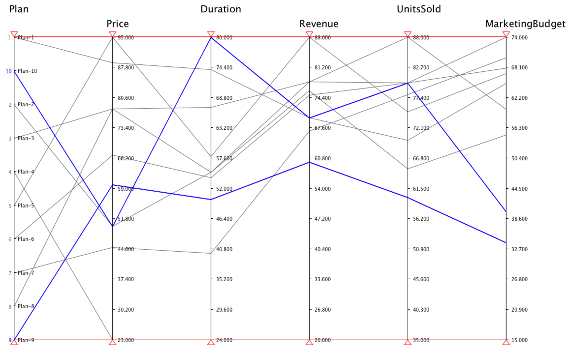
Parallel coordinates